The rebranding of Papa John’s seeks to rejuvenate the brand while staying true to its core values of quality, taste, and authenticity. The goal is to refresh the visual identity to resonate with a broader, more modern audience while reinforcing the brand’s commitment to premium ingredients and exceptional customer experience. Key to this redesign is an emphasis on a more contemporary and approachable aesthetic, incorporating geometric shapes with the original color palette. This will be reflected in the logo, packaging, and overall brand presence, ensuring that the brand feels both familiar and exciting to current customers while attracting new ones.

Style Guide


Research Process


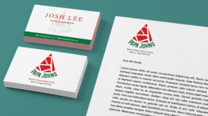
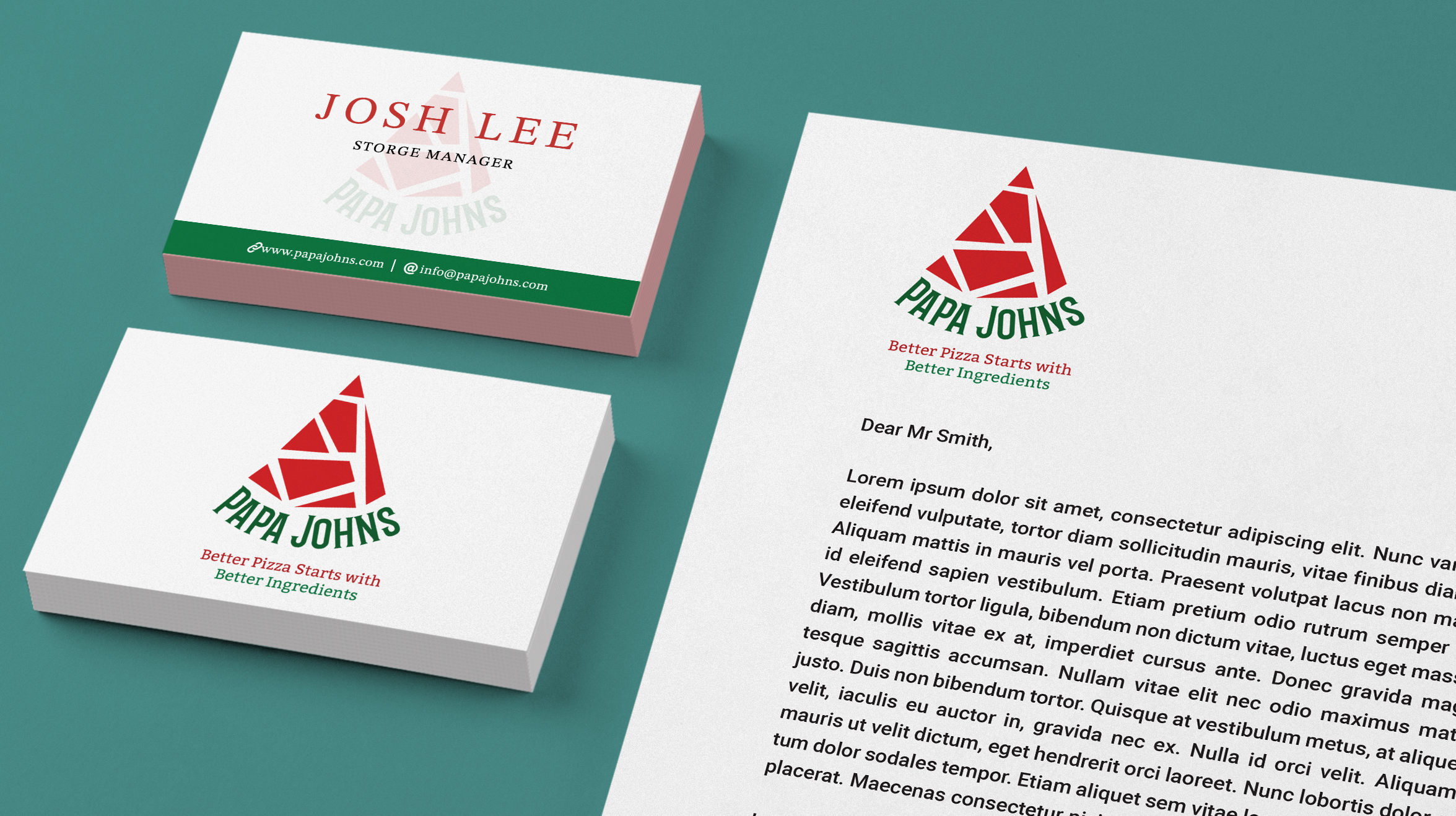
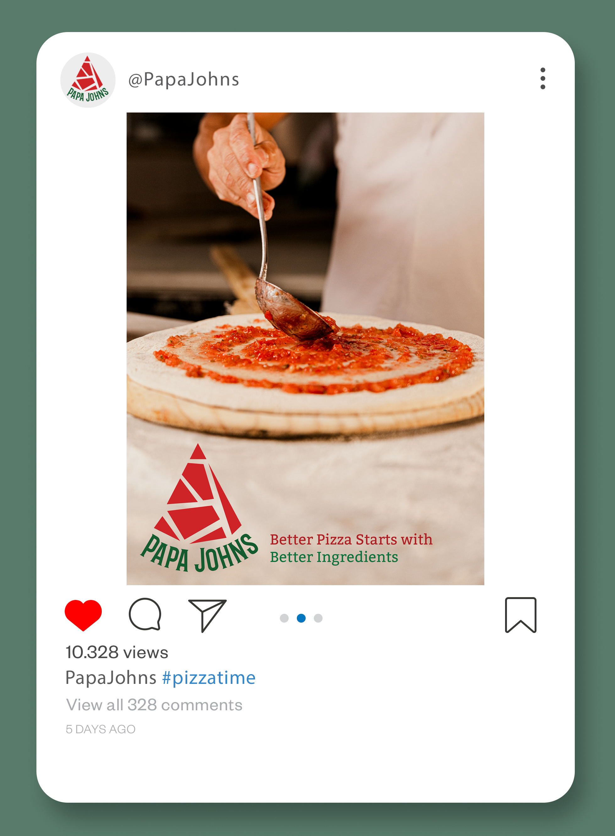
Mockups